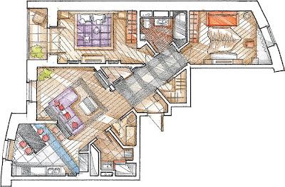
Architects have proposed a radical change in the spatial solution: static and a bit boring boxes of rooms after the reconstruction had been deployed along the diagonal on a common axis of the flat. As a result, the rhythm of the internal space has gained momentum, it is appropriate energetic way of life of all family members: a lot of hard working parents and their son-starring.

Canopy, with the exception of cast concrete, dismantled and re-built from bricks, only the wall between the hall and living room, and between the dressing room and lounge, which are built penaly sliding partitions made of plasterboard. In this arrangement the walls had been partially modified. The core of the apartment was the hall of song, which went door to majority of rooms and utility rooms. Holl shape elongated rectangle and deployed at an angle of 45 ° to the front door. It appeared in the small triangular space, they turned to the subsidiary: such "corners" in the apartment are never superfluous, and if there are more, the better.

In the entrance hall and formed a compact intermediate space with banquettes - it can be entered to sit down, not getting into the field of view of those who are in the living room. Close - wardrobe in it - two bracket with hangers and shelves for shoes. Dismantle the wall, "aperture" in front of the entrance was not possible, and it also emerged corner where equip storage. As a result, in the hall are seven doors, three of them made the sliding, so as not to clutter the space.
Kitchen-dining room is separated from the living room, only a small monolithic pylons, it is adjacent to the bar of the plasterboard. In parallel, it built a new wall of the living room - it "goes" baffle, delineate the front zone and a hall. Along these two parallels built furniture - dining table and sofa. It seems that both the room like a slightly unfurled to their former locations. Effectively focus on the diagonal corners of the entrances. Planning a bedroom and a son of the room has changed less, but these rooms are seen in unusual perspectives, as well as their inputs are located on the corners. With this "reshaping" the bathroom and guest bathroom are not able to maintain the correct geometric form. But the architects skillfully defeated it. By analogy with the kitchen to the bathroom a prismatic niche decorated with "sea" ikebana. WC, to the reconstruction with adjoining pantry uzenkoy have increased, so that the toilet was a cozy place and a place for the isolated postirochnoy.

After re-opened if space: Flat think twice actually. From the hall opens a perspective view of the front zone and private rooms, a variety of plans for sequence creates the illusion of more than the reality scale. The dynamic diagonal angle energized. This followed amenities: business premises are located "near" but not in view.
Expressivity planning in support of their trim, designed to nuances. The color of most rooms built on the contrast of dark (furniture with an oak veneer finish, tinted by wenge) and light (vybelenny oak floor and part of - the furniture, beige ceramic, tender olive wallpaper). Against the backdrop of the walls is made of light dark window sills, door and window frames, Skirting boards and shelves. Podshivnoy kitchen ceiling razgraflen on large squares of decorative beams. The quiet tone changed only son in the room: sofa and chair are covered with carrot-colored cloth, the same color is present in the decoration lamps.

Elegance dining gave "silver" niches that supported the design of chairs. With their help, have decided to introduce an element of the game, epatazha: around a minimalist dining table set with chairs covered susalnym silver claret seat backs and the style of Al deco. The last echoes burgundy chandelier hanging above the bar and the vase in a niche.
The interiors are decorated with an unusual and a bit theatrical lighting system. Light sources are many and varied. In addition to hanging ceiling lamps, table lamps and sconces are widely used spot lights, built-in ceiling. Emanating from them "fans" light effect "tear out" any significant detail (for example, a panel of Japanese-style room, a silver surface niches) and create more complex than the traditional coverage, the cut-off figure.

House, of course, has a bright, strong character and is a rather sharp energetic combination of efficiency, practicality and artistry.
No comments:
Post a Comment